2020
Intellisense
Smartphone case for the blind
ObJECTIVE
How can we improve the lives of the visually impaired and their ability to function with modern day technology?
Problem
Many blind people use Smartphones, but they are difficult to manage and tend to be overly complicated for people with this disability.
Solution
A versatile device that will help the visually impaired and simplify the interaction between them and their smart phone.
Existing tech
There are many phones and concepts out there created for the blind, but they are limiting and do not provide all the features that are accessible in a smartphone.
DESIGNING FOR THE IPHONE
UNDERSTANDING THE USER
I had the opportunity to meet and interview Jasmine Raya who is an iPhone user, tech savvy, and has been blind since birth. I asked her a number of questions regarding her experiences with her iPhone, and received valuable feedback.
INTERACTING WITH THE PHONE
-Uses VoiceOver and highly relies on hearing and sound for phone usage
PROBLEMS FACED
-Touch accuracy
-Awareness of interface activity
-Unable to understand certain tasks
-Privacy when using phone
ROOM FOR IMPROVEMENT
-Would like to be able to use other senses apart from hearing.
-Wants the ability interact through physical touch
-Wants to be able to visualize and understand images better
MOOD BOARD
brainstorming
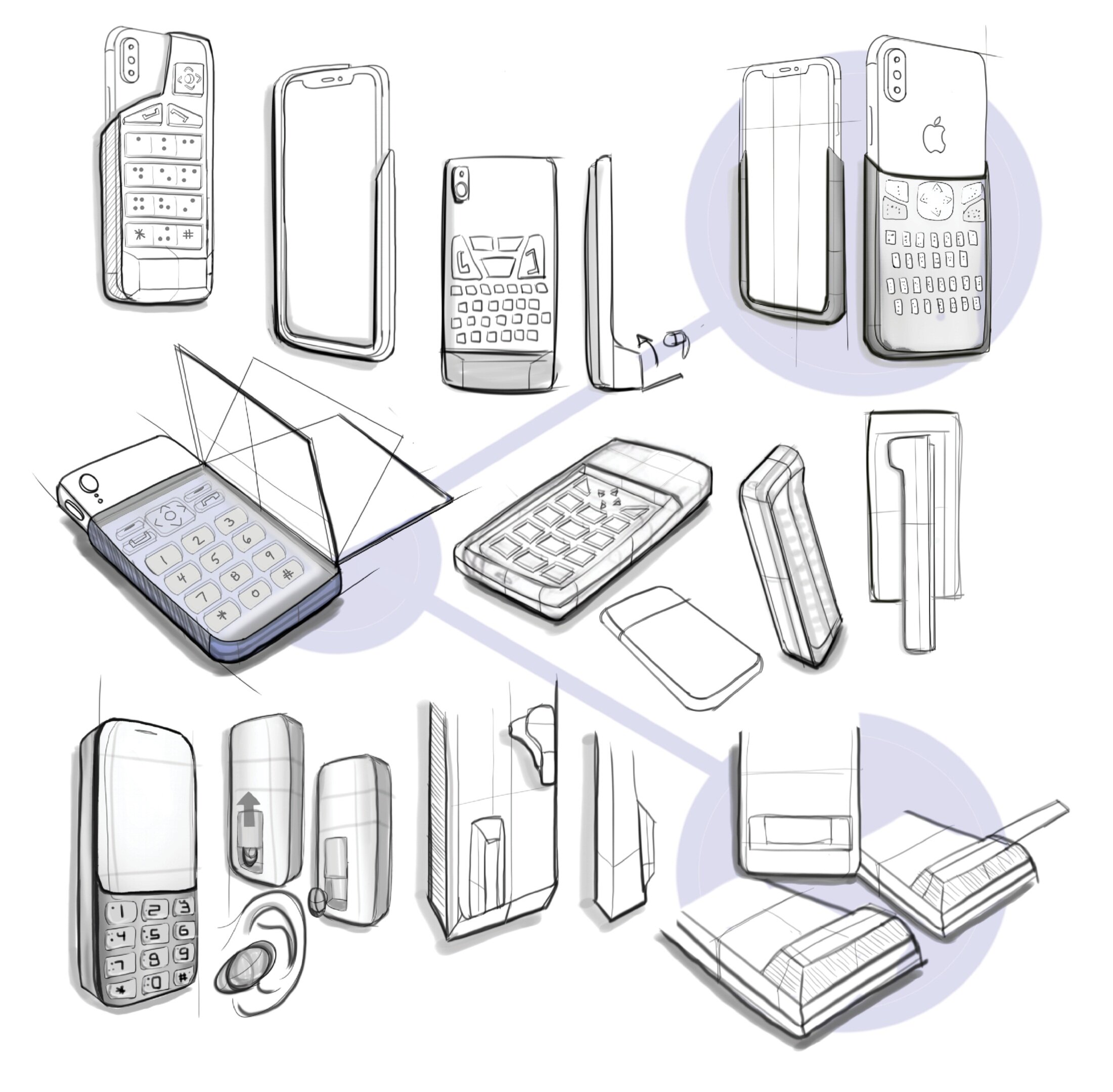
I start to brainstorm ways a blind user can use their phone through tactile interactions. These sketches consist of phone cases with added keypads, buttons, and braille.
Possible features
Here I explore further into specific features that I may want to add into my design. These concepts consist of phone cases with text buttons, keypads, buttons with braille, foldable covers, wireless headphone slots, and much more.
CONCEPT REFINEMENT
I continue to narrow down my concepts and focus on my favorited features that include; large buttons with braille, a keypad with a cover, and a keyboard with a single headphone attachment.
MOCK-UPS AND TESTING
After creating mock-ups and having users test them out, I come to figure out that the keyboard feature is the most favorited.
Buttons too big
Cover is inconvenient
Keyboard feature is favored by all testers
MOVING FORWARD
As I move forward with the development of my design, I decided I wanted a seamless aesthetic that emulates the subtle and polished look of Apple’s products. I make sure to add in the important keypad feature but remove all stationary buttons that relate to feature phones of the past. With the use of new technology, I am able to have a design with an overall smooth and continuous appearance.
FINAL DESIGN
FEATURES
FEATURES: With all the activity occurring on the back of the case, the surface can extrude keypad buttons when needed for tactile typing, pop-up braille for independent reading, and subtle risen silhouettes of images for the user to visualize through touch.
WHATS HAPPENING? Computer vision detects the image and sends the information through to the connected device where it can then process and display a physical output to the surface of the phone.
ENABLING TECHNOLOGY
HOW DOES IT WORK?
A combination of smart materials, electroactive polymers, sensors, and actuators are incorporated. Miniature piezo actuators manipulate the morphing foam and surface material to extrude keypad buttons, braille, and images through the surface.
CONSIDERATIONS
Although a “piezo actuator surface pad” has yet to be created, it is possible that technology similar to that will be available in about 3-5 years. Some of the mechanizations incorporated in this device have been conceptualized to make sense of its technical functionality.
EXPLODED VIEW
COMPONENT VIEW
COLOR, MATERIAL, FINISH
ORTHOGRAPHICS
HOW TO USE
Activating braille: Swipe to the right on the upper portion of the surface. To turn off, swipe left in the same area
Activating keypad: Swipe right across the bottom of the case where the keypad is located. To deactivate, swipe to the left in the same area.
Activating photo touch: Swipe up from bottom to top to display photo. To clear the image, swipe back up.
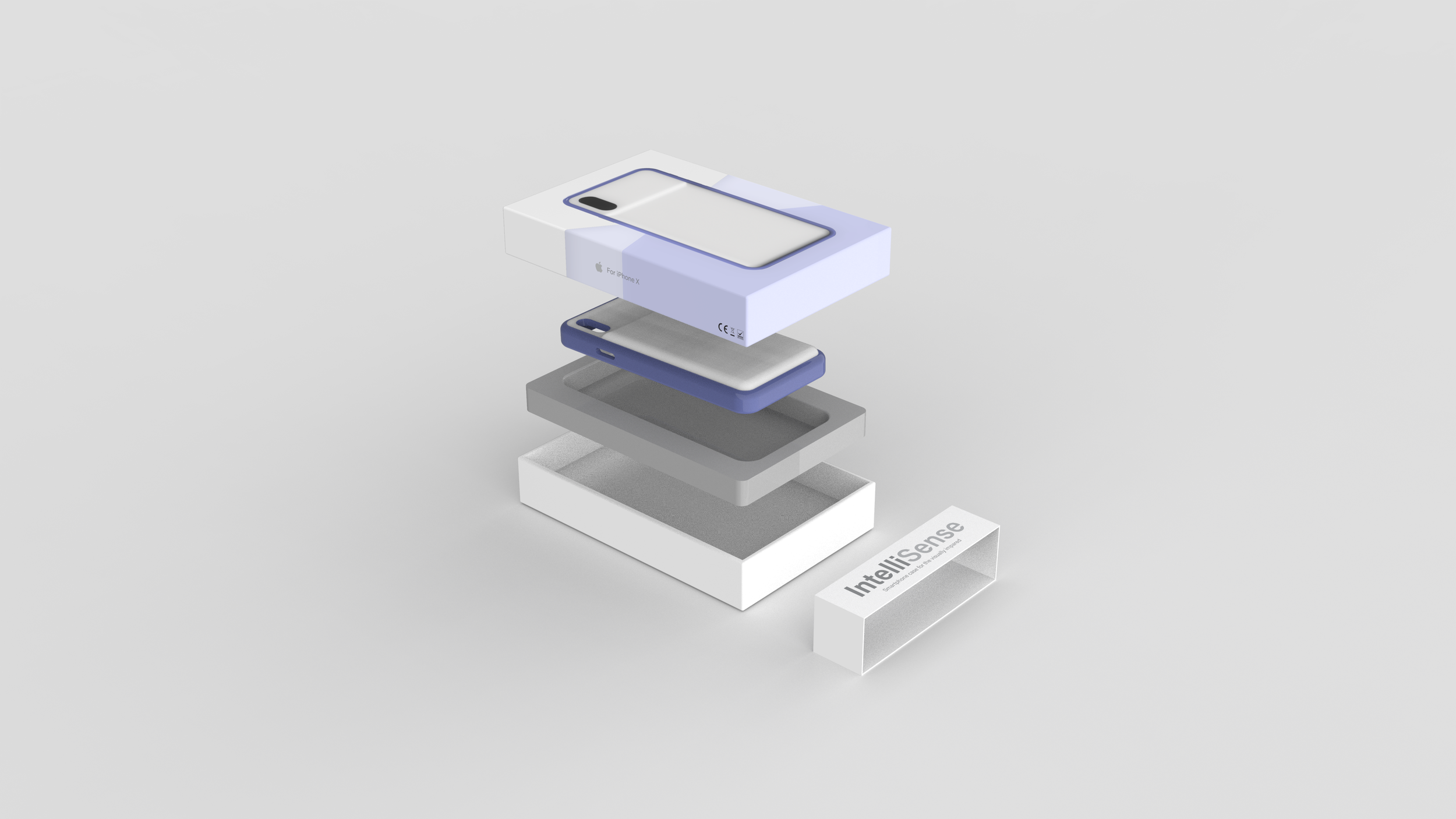
PACKAGING
SEE BY TOUCH
IntelliSense


